
Perhaps one of the most apparent observations of Obamacare was that it put more emphasis on numbers and costs than the care of the patient. Emergency physician groups will struggle to attract patients to their hospital groups if their brand and people are not positioned to combat this perception. With that in mind, this is the story of ESP – now called Ergentus.
Garrison Everest was contacted by Ergentus, formerly ESP (Emergency Service Physicians of Colorado) to provide graphic services to clean up their corporate identity. However after the initial discovery phase we discovered that ESP was in need of more than just a new logo.
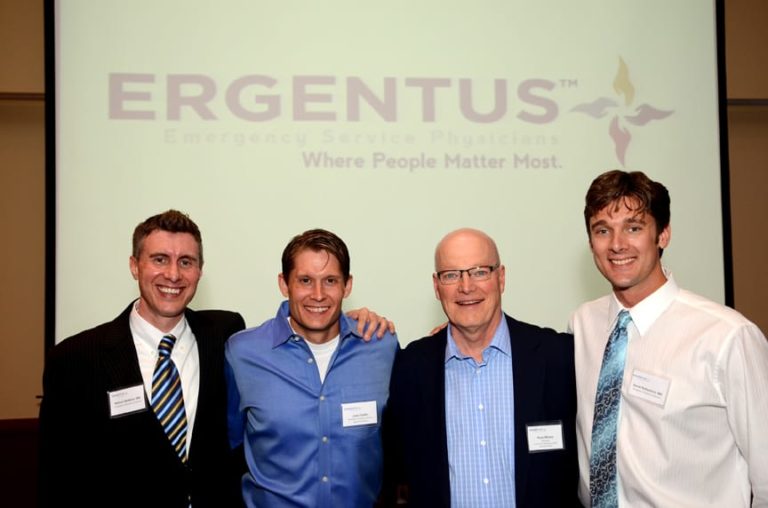
After a few conversations, ESP (founded in 1976) chose to take a more strategic approach to its rebranding and hired Garrison Everest for brand development. We worked with a committee of 8 physicians through the course of 10 months to help them uncover what made them unique, relevant and worth considering in the marketplace. The outcome of the brand development process resulted in brand clarity and brand direction to its 65 physicians that previous was not identified.
Through the process we also saw the urgent need to rename the company. ESP’s name existed in a marketplace of alphabet soup with no clear differentiation amongst its competitors. In order to better cut through the clutter, we took ESP through an extensive naming process which resulted in the name Ergentus. The challenge with naming a company in the health care industry — which takes up 16% of the gross domestic product and about the same of the world’s economy—is that almost every name conceivable was taken or was a registered domain name. If it wasn’t available in the U.S. it was taken in Europe. In the end, we landed on a name that was available for domain registration and trademark and more importantly provided Ergentus with an attractive, interesting and innovative identity.
Ergentus is an invented name. “ER” means emergency or emergency room; “GENT” means gentle in care, or the genesis of ideas – that speaks to the organizations innovative focus; and “US” which means team.
The logo contains a hidden cross within the hands which represents the team aspect related to health care – which also fits perfectly into the ACO mandate which demands collaboration of health care providers.
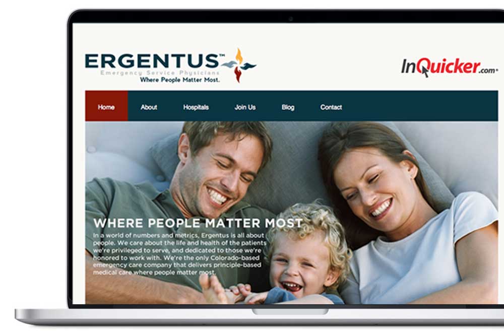
Ergentus’ tagline: “Where People Matter Most” is the distillation of all that Ergentus believes. Its focus as a whole is on the patient first. We found after working with this specialized group of emergency physicians and physician assistants is that the majority of them possessed unique characteristic and personality traits. Not only are they brilliant in what they do, but they also possess a level of compassion and professionalism that are not usually found in other industries. This group truly does care about the people whose lives are in jeopardy.
Ergentus was acquired by USACS in 2015.
How we helped
- Brand development
- Naming
- Logo design
- Tagline: “Where People Matter Most.”
- Website design & development
- Brand standards
- Strategic planning & consultation
- Copywriting
- SEO
- Brand rollout
- Advertising